My today’s post is about Survival Analysis with Kaplan-Meier Method.
This post uses an example for a popular multivariate
analysis textbook to emulate the problem and hence providing and excel based
solution to it. For this post our point of focus will be how to emulate the
analysis on Excel rather than theory. For theory there is several standard text
available that can used for understanding theory behind the method.
The method we are discussing is Kaplan-Meier Method. The key
is to make a table with survival data and then process with the calculations
involved.
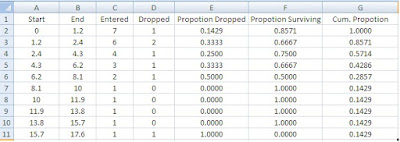
Interval Start:
The first Cell is entered manually; rest equals the end interval of the upper group. Say for group 2, the start interval is equal to end interval of group 1. (A3 = B2)
Interval End:
Start interval of the corresponding group multiplied by 2 to give end interval. For first group it is manually entered.
Entered and Dropped:
These are from your observational data. This basically described how many patients entered the time bracket we are considering for example for the first group, time bracket is from 0 to 1.2 month. For this group 7 in Entered means those 7 patients were admitted at the start of this group. Whereas 1 in dropped means that by the end of 1.2 months, 01 patient was lost or withdrew from the observation, thus only 6 patients entered the next time bracket o f 1.2 - 2.4 months.
Proportion Dropped:
This is calculated by no. of dropout divided by total number entered for a an interval. For our case it is D2/C2
Proportion Surviving:
This is simply 1-(D2/C2) or for out sheet 1-E2, theoretically it is ..
$$Proportion Surviving=\frac{Total Patients - Dropouts}{Total Patients}$$
Cumulative Proportion:
This stands for cumulative proportion
surviving and this is of actual interest to most of the people. Formula for
this is:
$$Cumulative Proportion=\frac{Patients Survived for till an Interval}{Total Dropouts}$$
For our case the formula is =C2/SUM($D$2:$D$11)
Creating a Graph:
For K-M Estimator, the standard graph is a stair-case like
graph, but for the sake of simplicity and ease of use, a simple scatter plot
can do the trick.
With this chart you can add a trend. For trend lines, if our
data starts with zero, we cannot use power and logarithmic trends lines, hence I
have used polynomial line with 3 – degree and it is displayed as equation in
the graph.
In the next post I will explain how to calculate the hazard
function and density function and standard error for the survival analysis. You
can download workbook from this link.


